Elliot & Ostrich
- Brand Strategy
- Brand Identity
- Touch Points
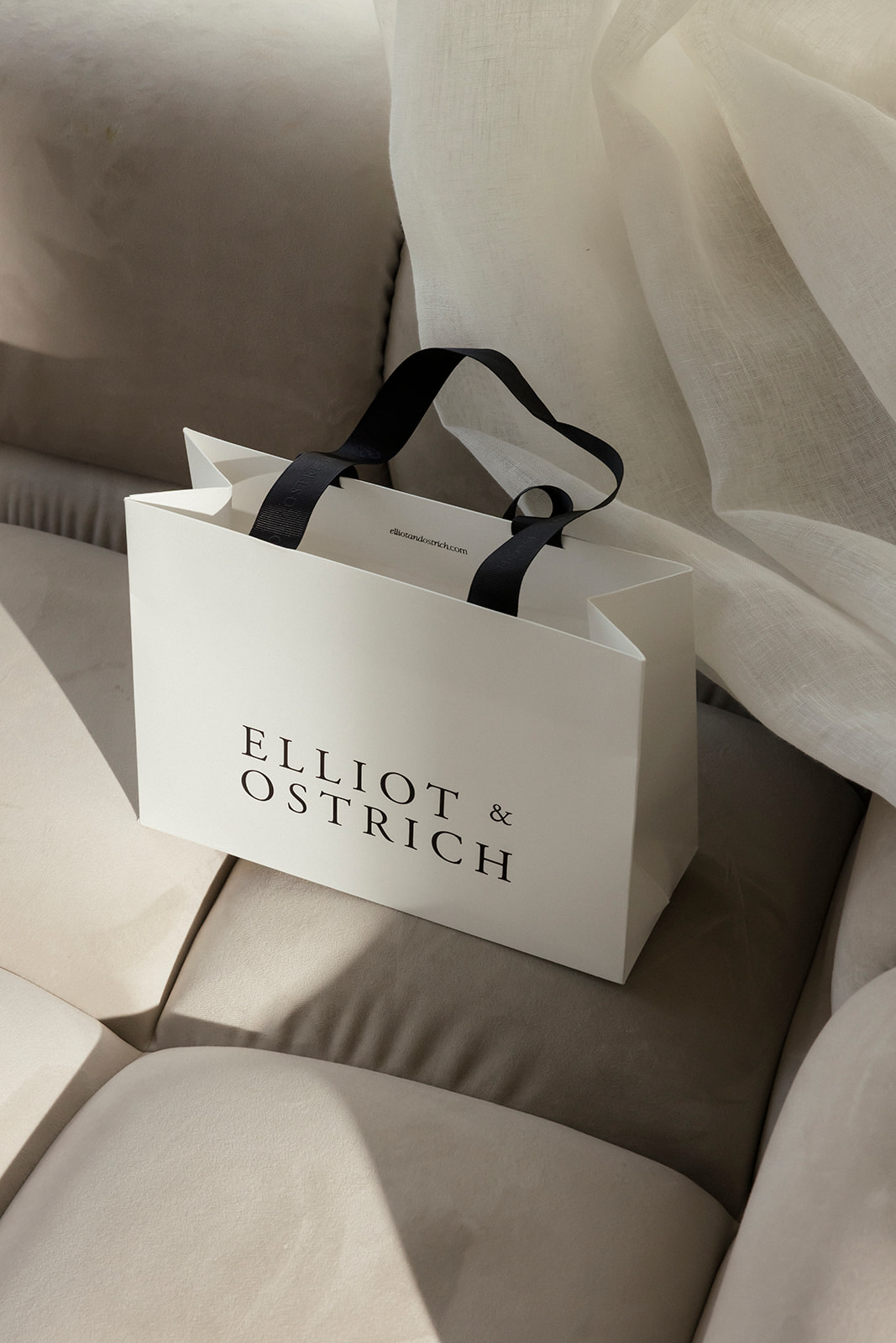
- Packaging
- Website
Year
2019
E&O sought to launch a fine jewelry brand that reflected each individual’s unique journey. Our task was to design a visual identity that showcased the exceptional quality and elegance of the jewelry, while highlighting the personal aspect of the brand.
Year
2019
A CLEAR PURPOSE
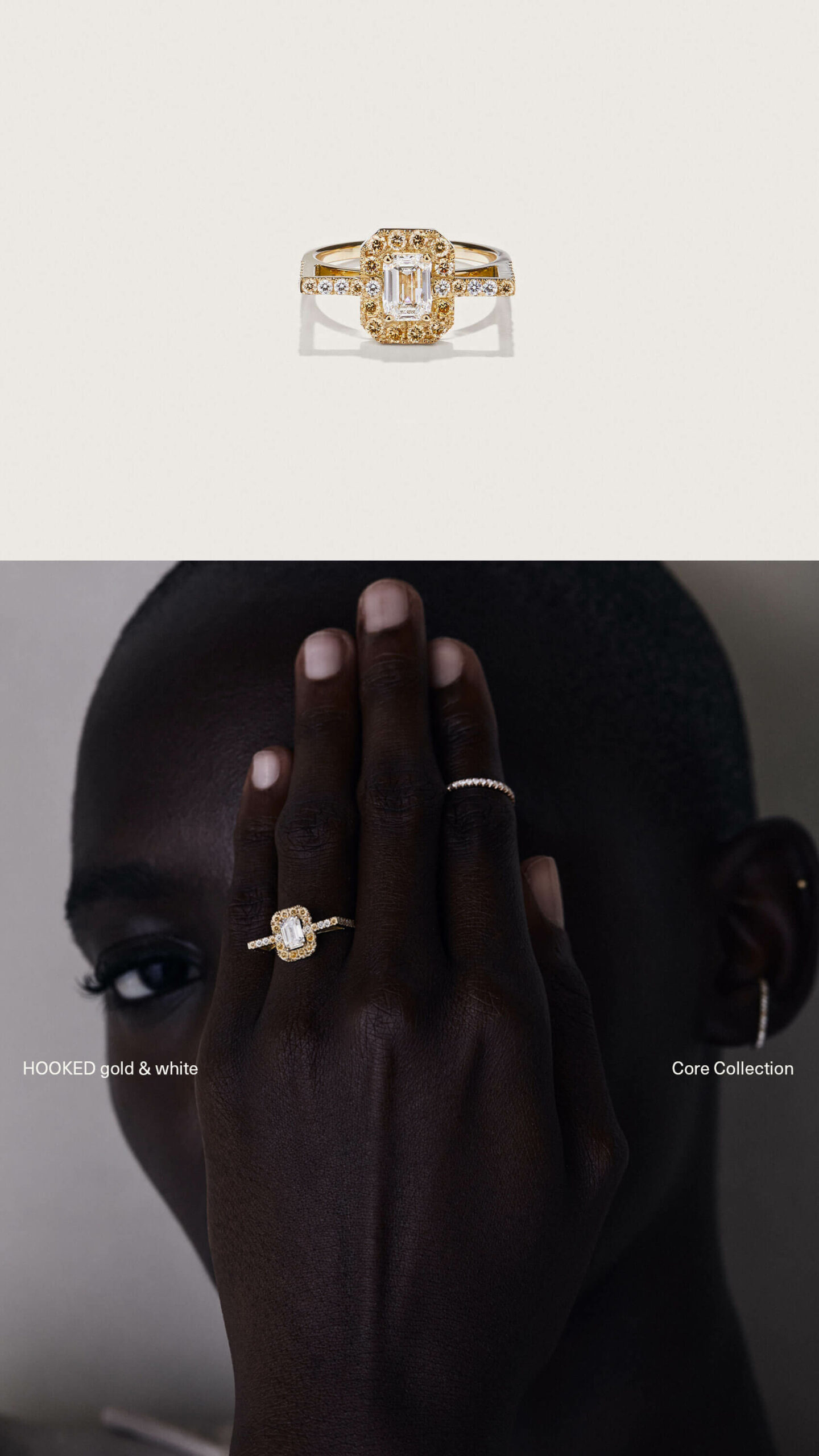
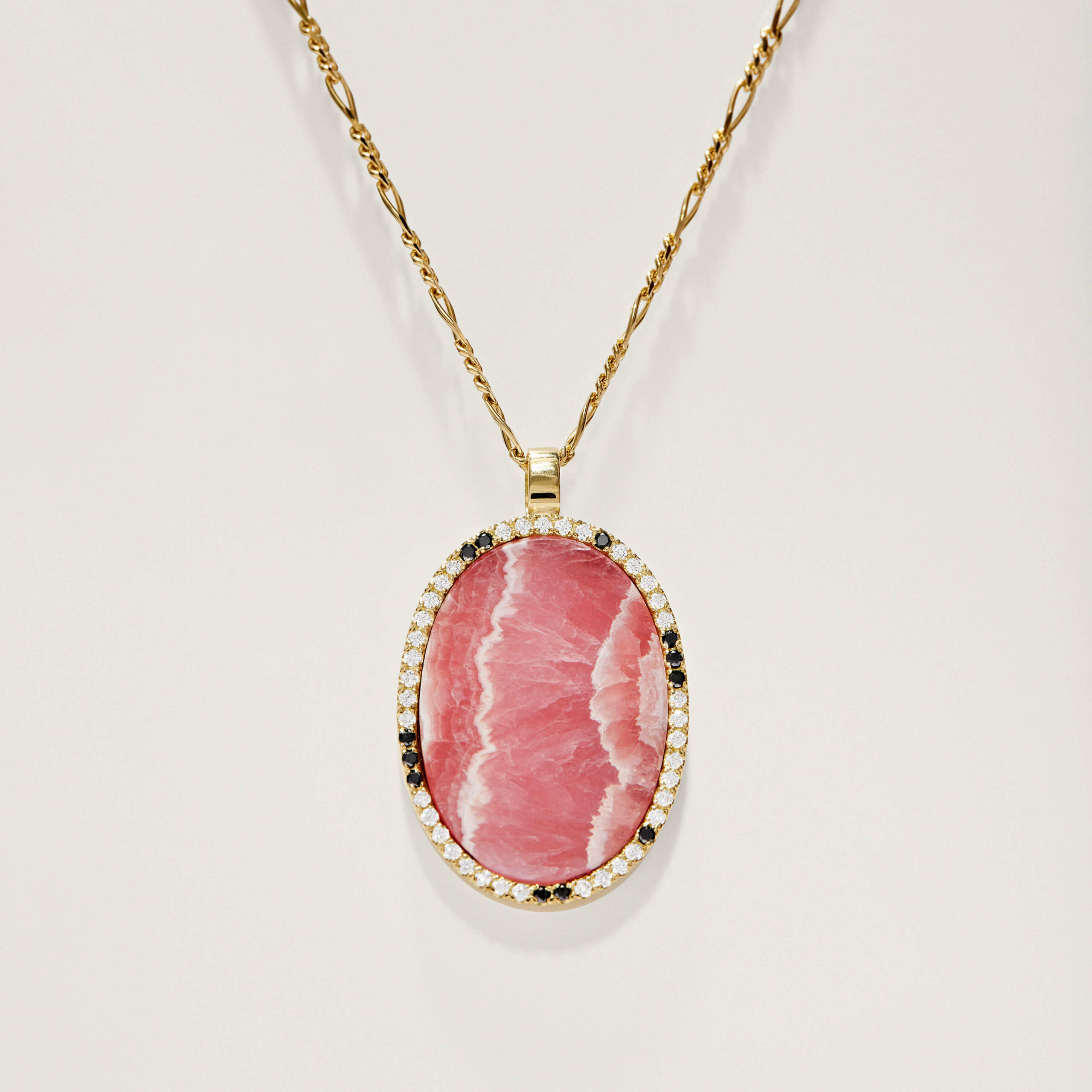
They entered Antwerp’s highly competitive jewelry market with a clear mission – to tell customers’ unique stories in a vibrant way. Each piece is made to order by hand in Antwerp to the highest quality, meant to be treasured forever, stacked with other meaningful pieces and passed down as a story to inspire the next generation.
VISUAL SOPHISTICATION
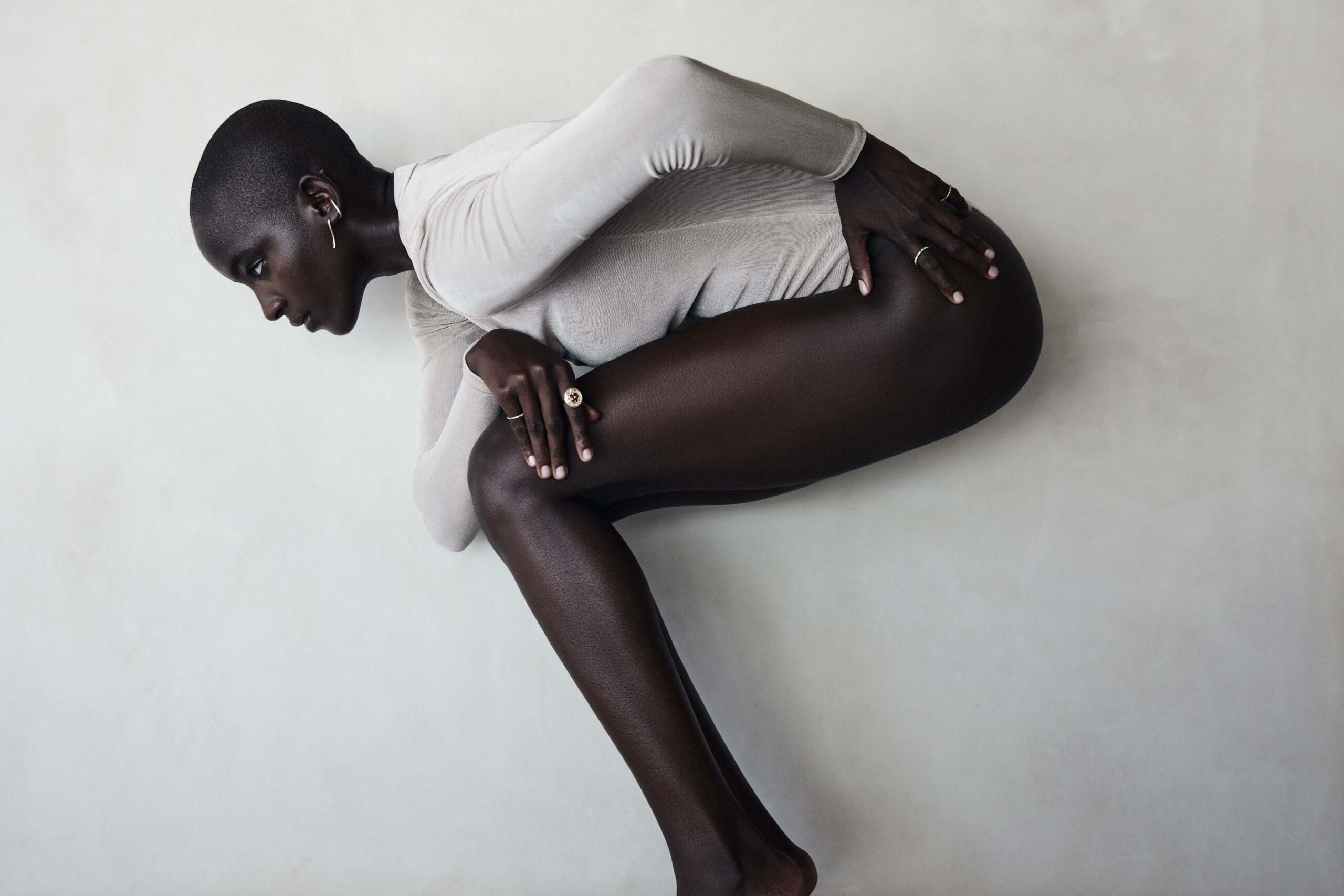
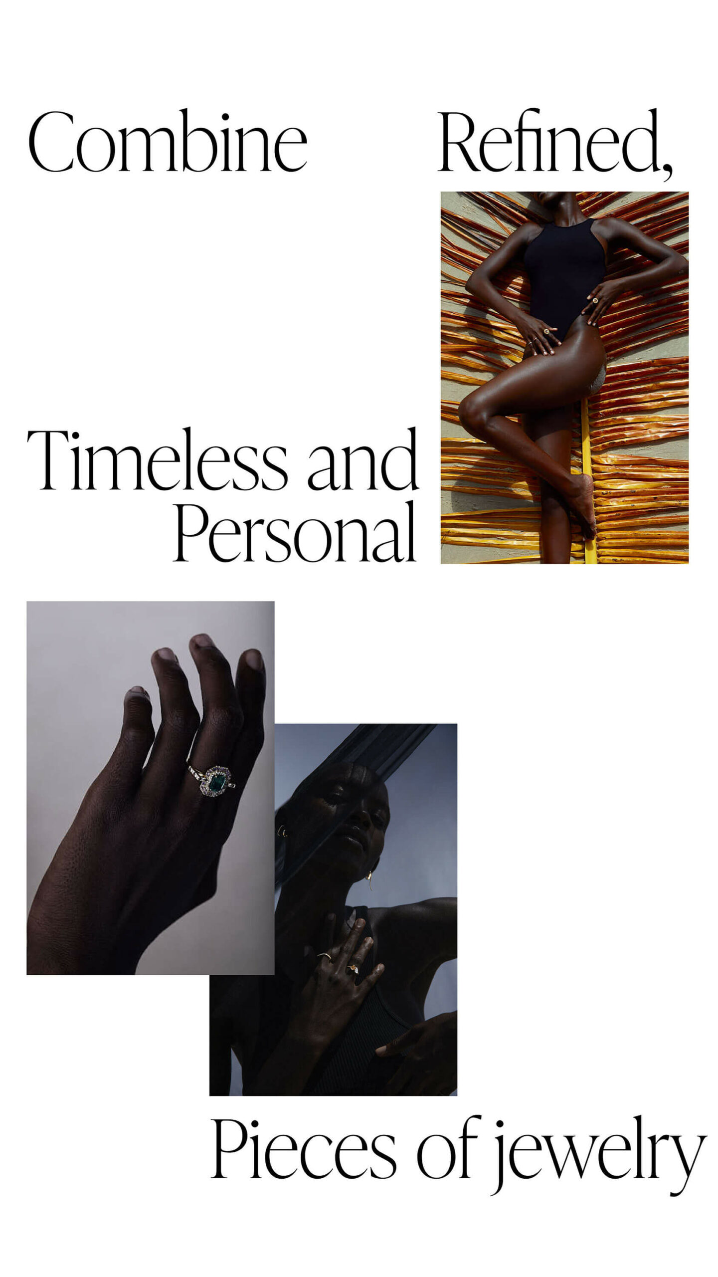
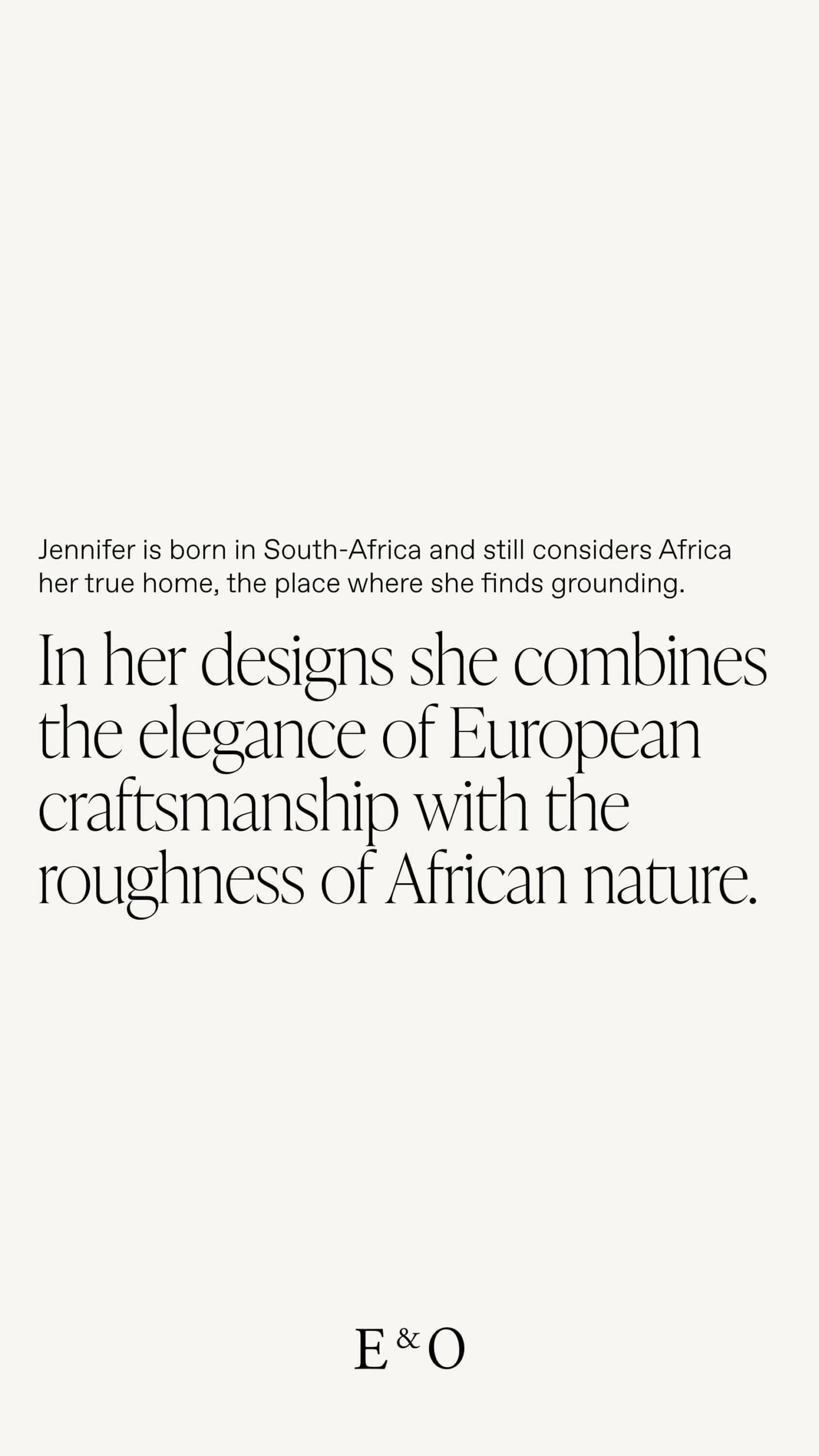
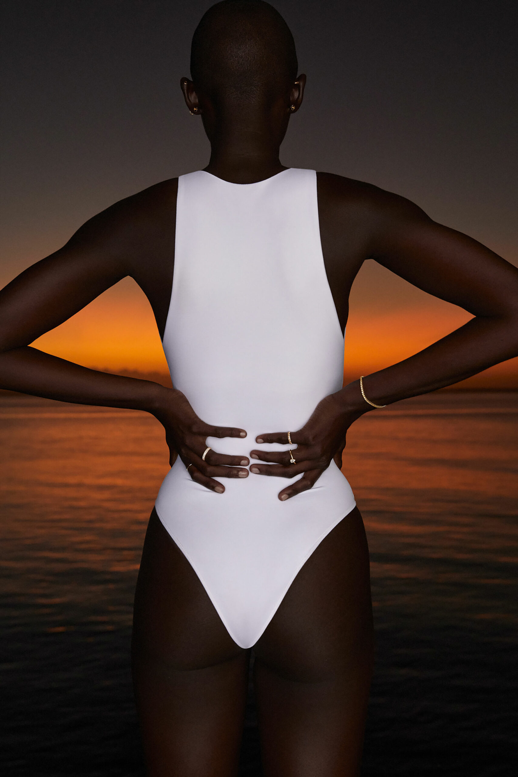
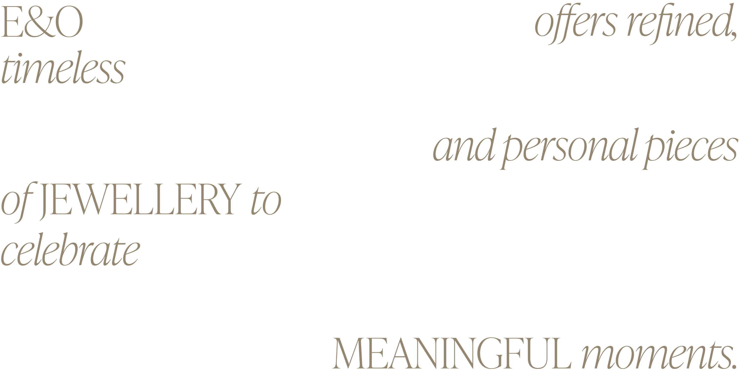
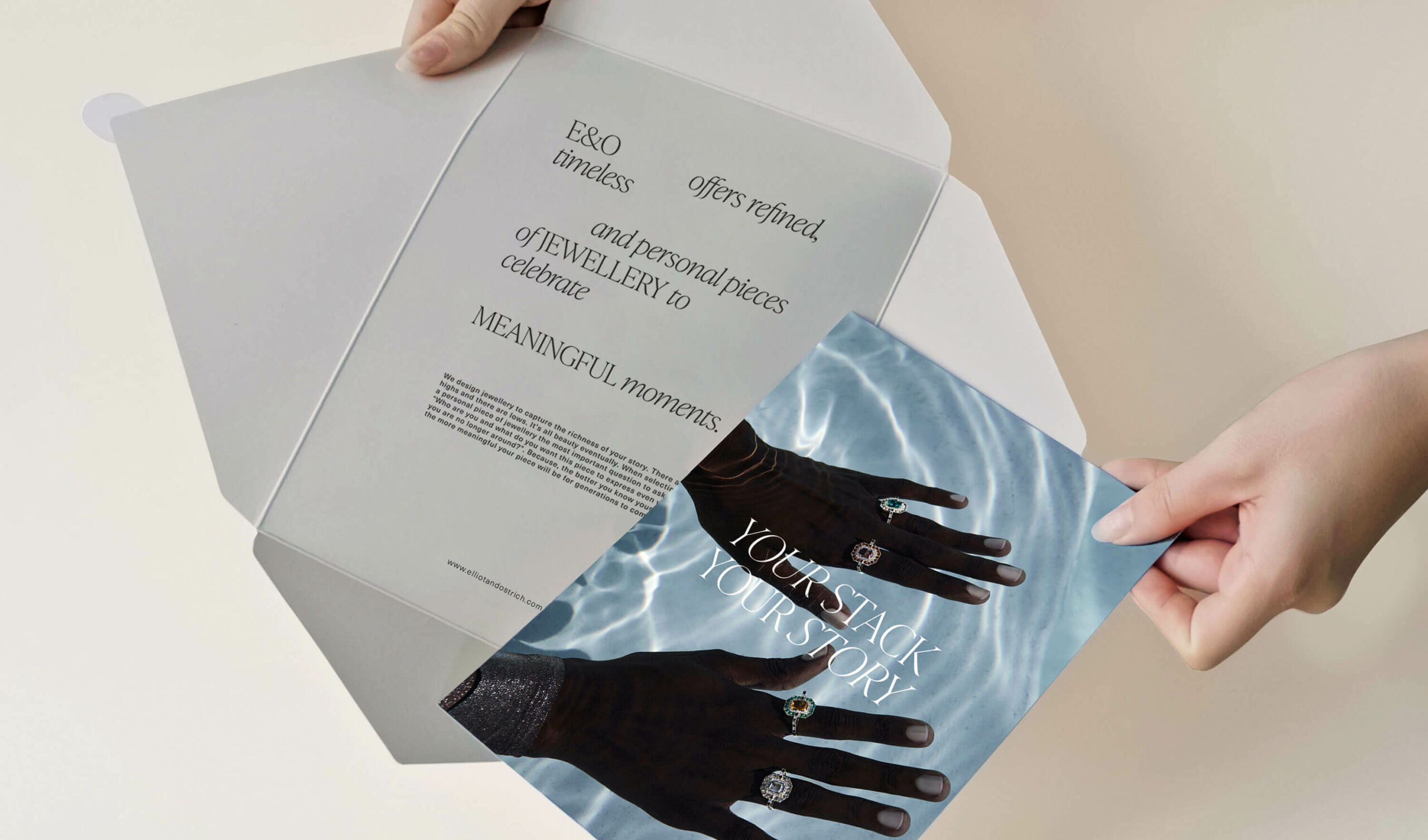
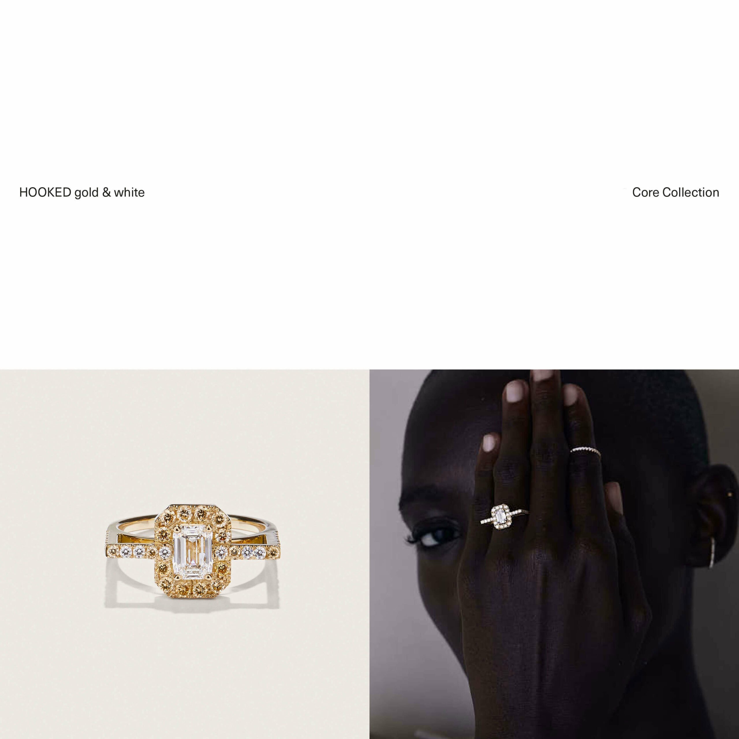
To complement their bespoke pieces, we designed a sophisticated visual identity with bold elements throughout. We chose an elegant font to highlight important text and used it as a big eye-catcher. On their elaborate website, we paired it with beautiful imagery that merged their rich history with their one-of-a-kind pieces.
LONGTERM PARTNERSHIP
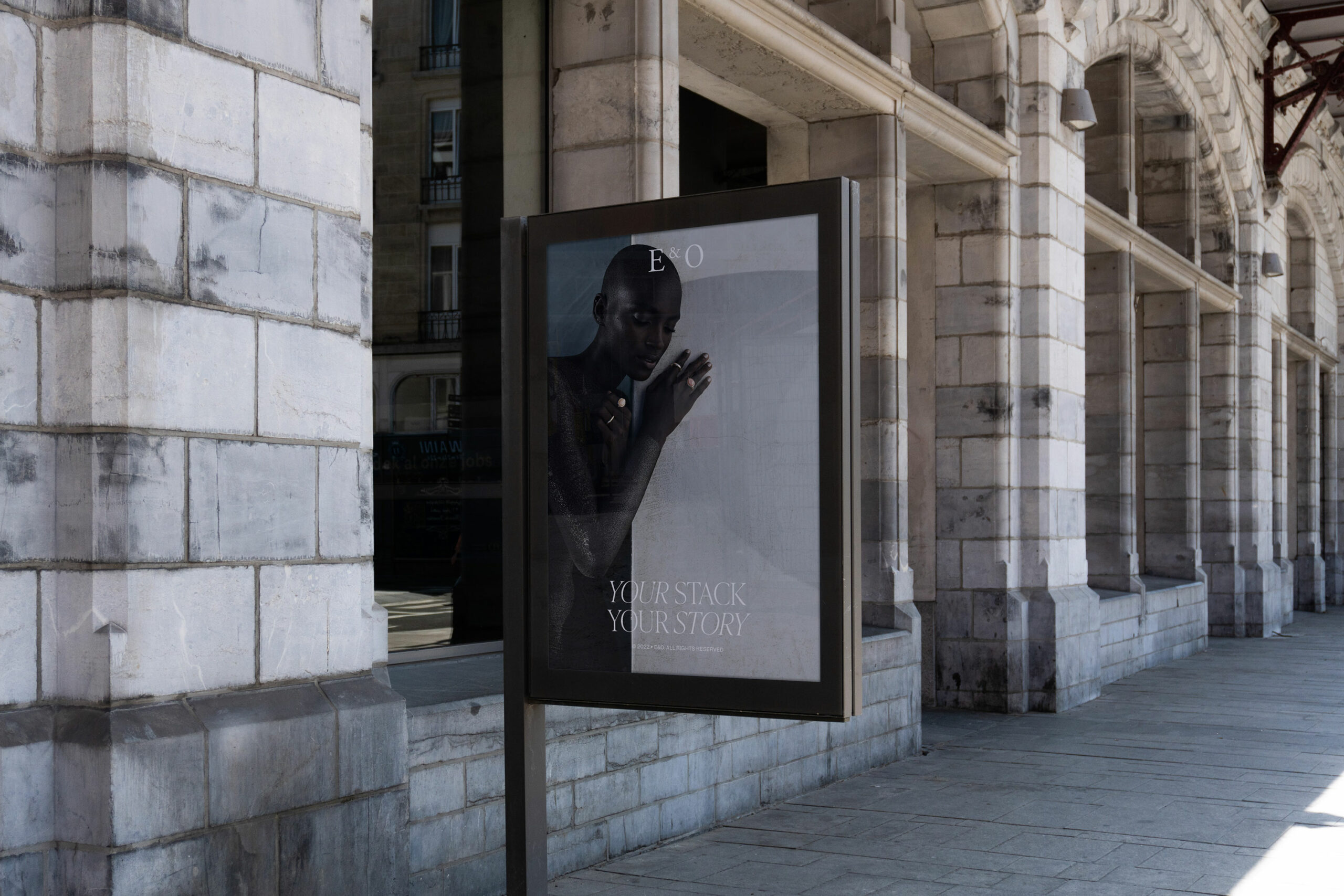
Throughout the years, we have seen Elliot & Ostrich grow from a small startup to a prominent player in their industry. Our branding strategy has evolved alongside their business, always playing a crucial role in developing concepts and pursuing new avenues. We have collaborated on everything from logo design and packaging to social media templates and website development. Ultimately creating a brand that stands out, and most importantly, stands the test of time.
Credits
Photography — Marie Wynants
Production — Nono C
