Agave
- Brand Strategy
- Brand Identity
- Touch Points
- Packaging
- Web Design
- Website
Year
2024
What began as a simple family retreat soon blossomed into a beloved sanctuary for many. Barbara’s holiday home, once a quiet place to cherish life’s simple pleasures, has grown beyond her wildest dreams. With multiple locations all over Italy, a new way of hospitality is born.
Year
2024
THE VIBE
Each Agave Flower breathes warmth and genuine Italian hospitality. They welcome you as if you’re part of their extended family. Committed to creating a lovely and memorable experience for each and every one.
Over time, many guests have formed a deep and meaningful bond with the staff – making them return every year without fail. Our goal for this project was to embody this essence of comfort, connection and belonging that is the heart of Agave.
UNIQUE IDENTITIES
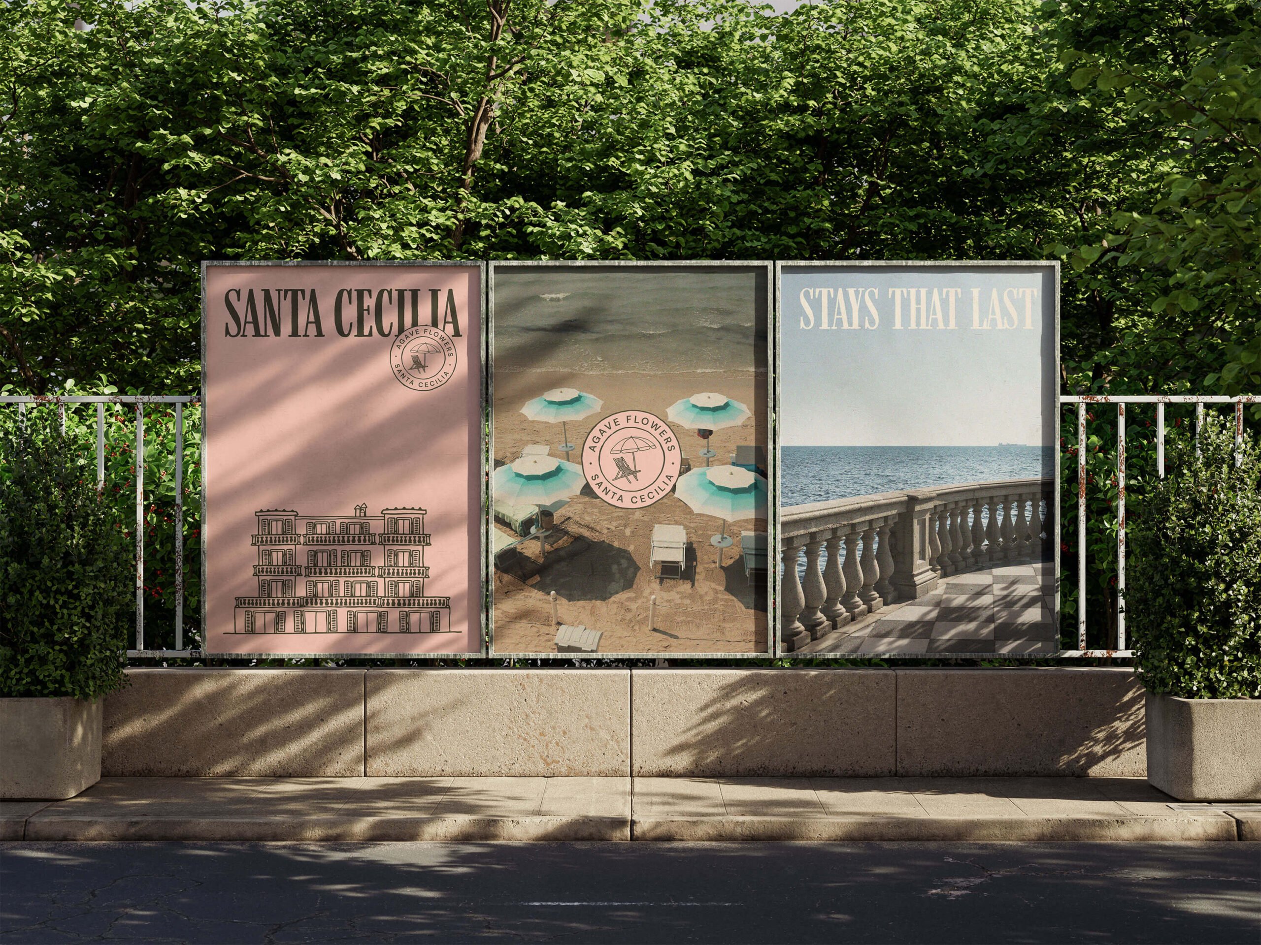
Like members of the same large family, each location has its own unique charm, style and identity.
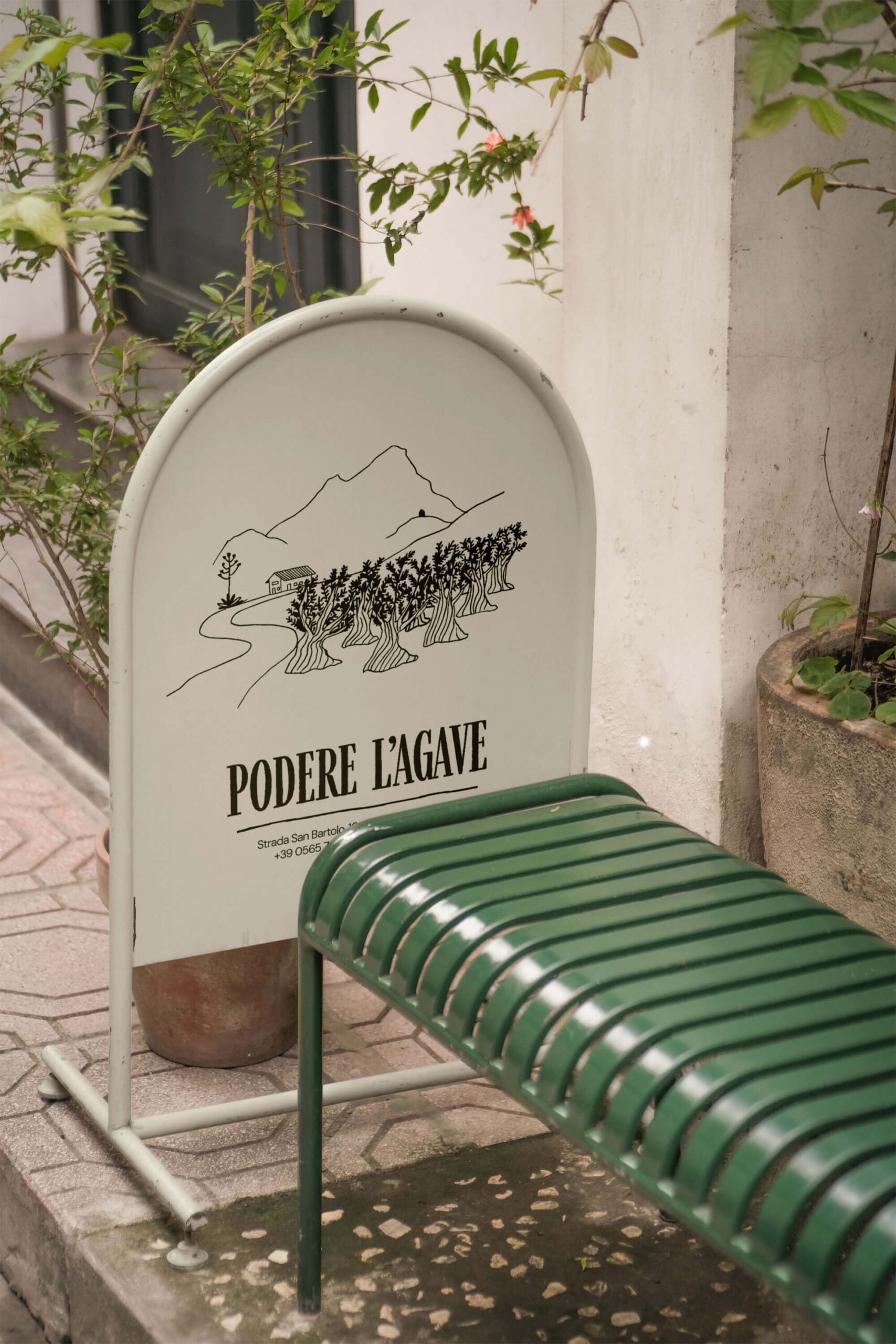
All different, but with one thing in common: to make you feel at home. To reflect their unique personalities, we developed a vibrant color palette with a specific color for each location. Accompanying these colors, we created bespoke illustrations or “stamps” typical of each site. These stamps serve as visual elements throughout the branding, offering guests a glimpse of their destination and reinforcing the local charm.
THE AGAVE PLANT
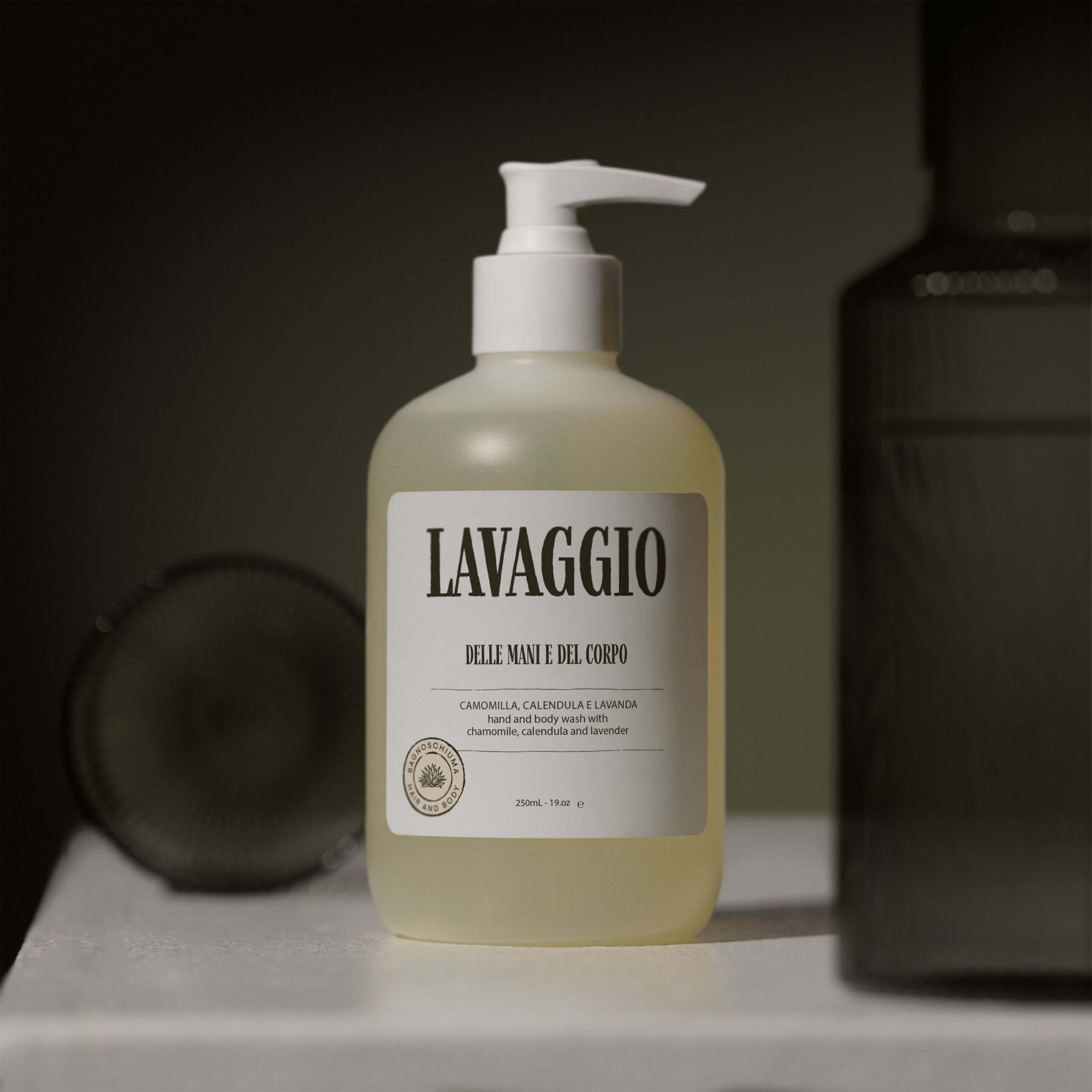
Inside Agave’s visual identity there was a big focus on the blooming Agave plant – a symbol of the brand’s growth. This illustration represents the organic expansion and nurturing environment that they provide. By adding motion to it, we really made it come to life – embodying Agave’s flourishing hospitality.
AUTHENTIC LOOK
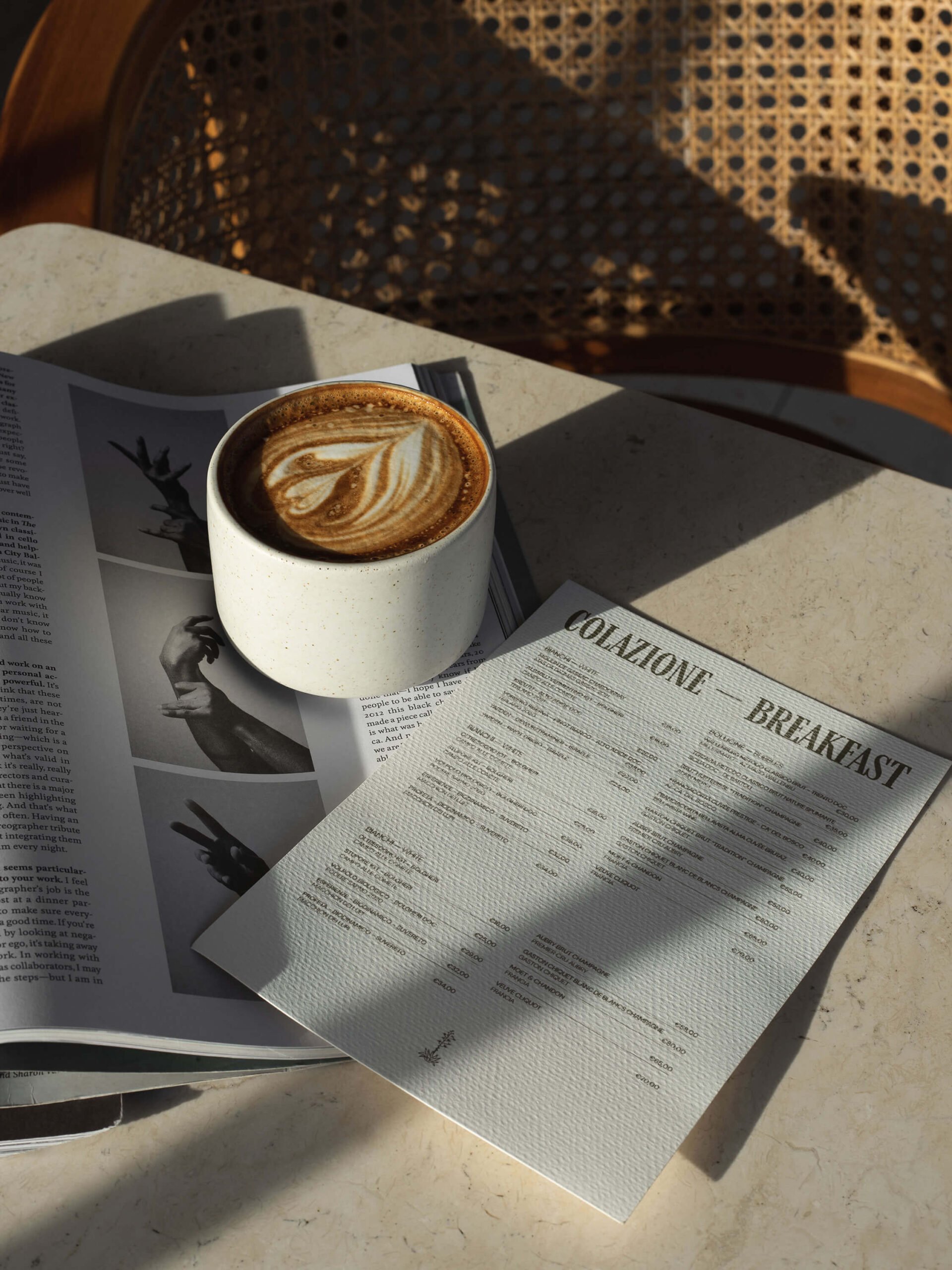
To highlight the brand’s authenticity, we used typography with rough edges. This design choice reflects the casual and familiar relationship Agave has with their guests, steering clear of a look that’s too polished or clean. Paired with a very dark green instead of a black, Agave Flowers instantly becomes more original and approachable.
PERSONAL TOUCH
Known for their genuine hospitality and lasting friendships with guests, we aimed to capture Agave’s iconic personal touch. By incorporating handcrafted and bespoke design elements, we ensured every brand collateral felt authentic and heartfelt. Every detail needed to reflect the commitment to valuing their guests. This unique approach creates lasting memories, making Agave not just a place to stay, but a place to belong.”


