Sue
- Brand Identity
- Brand Strategy
- Touch Points
- Website
Year
2022
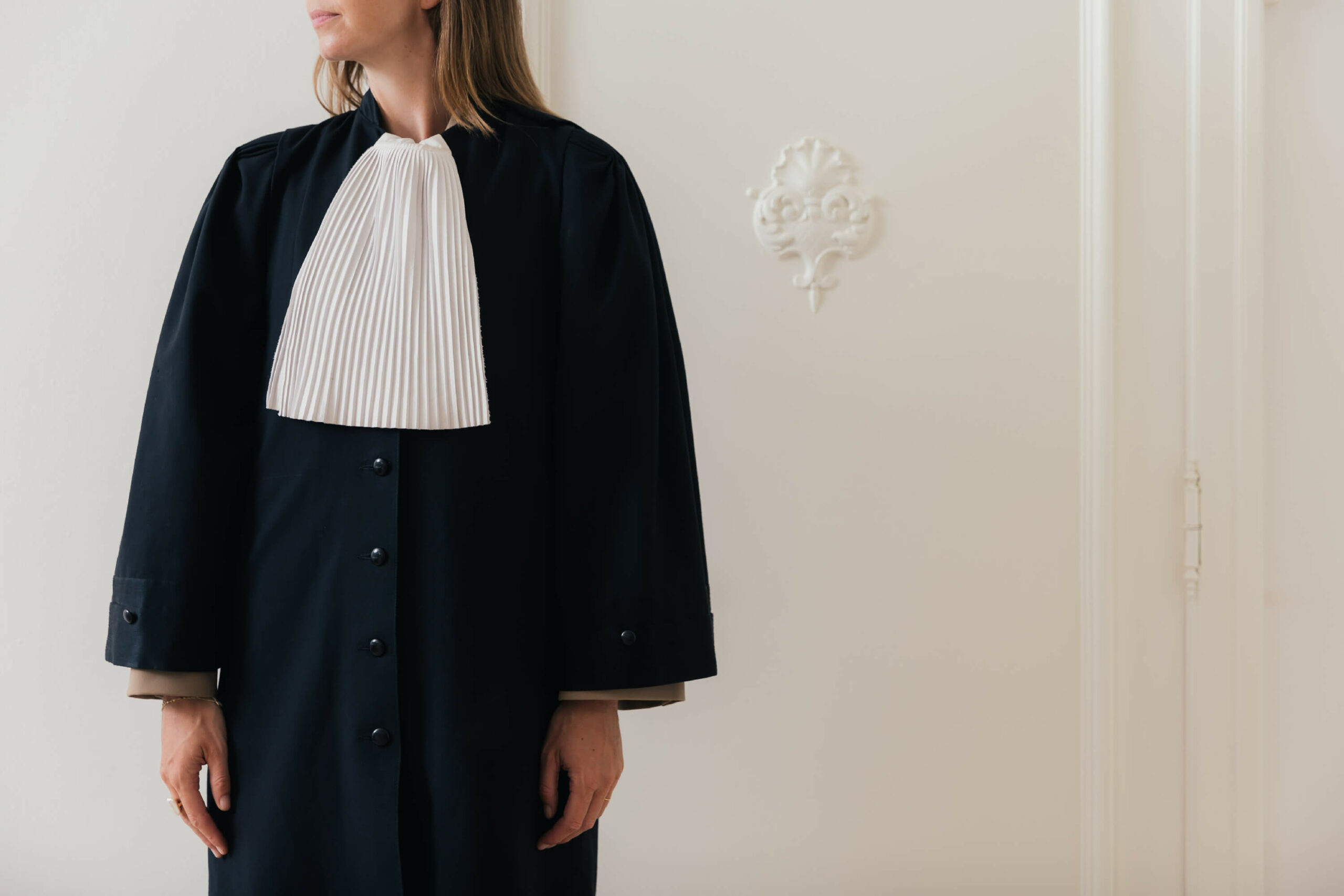
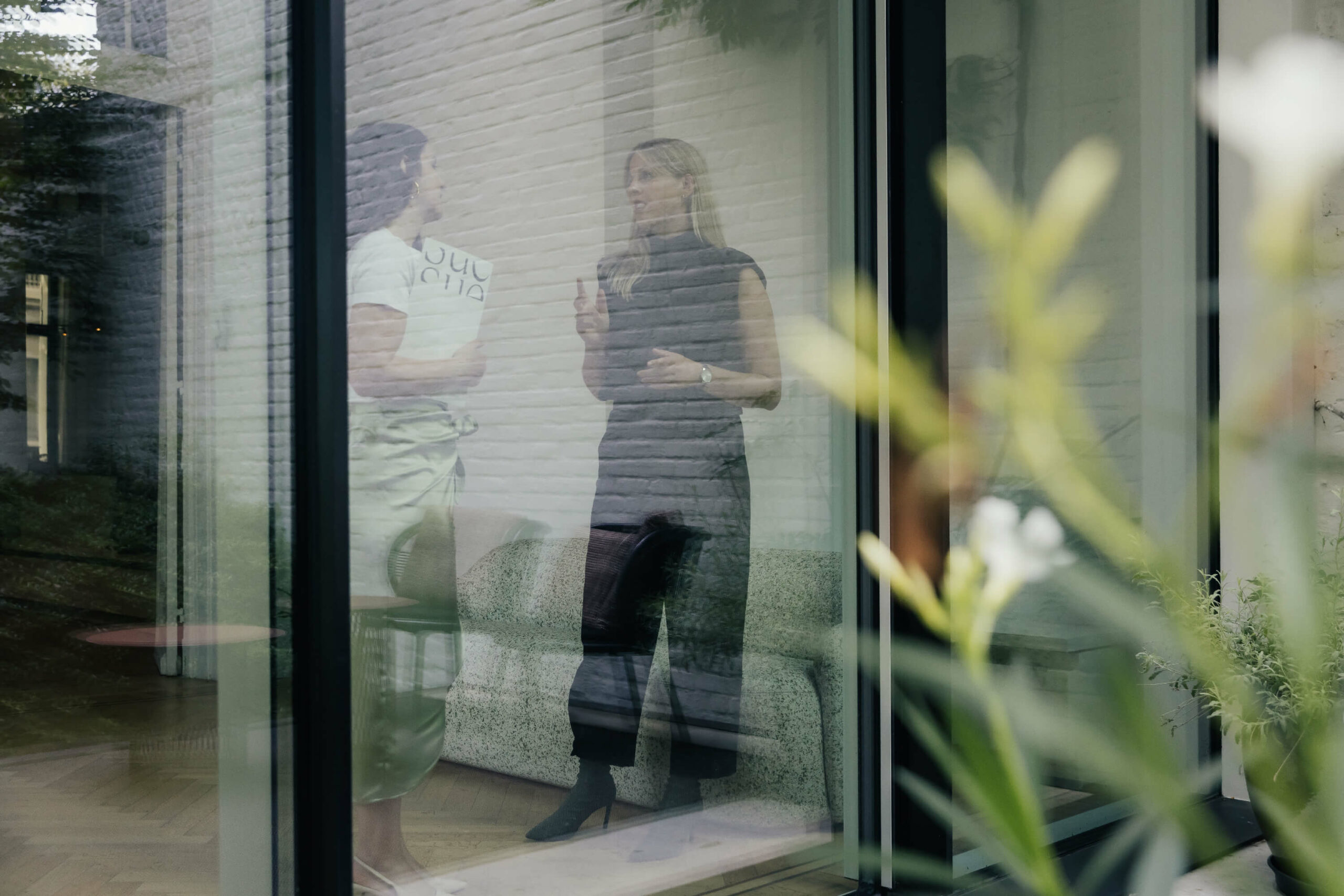
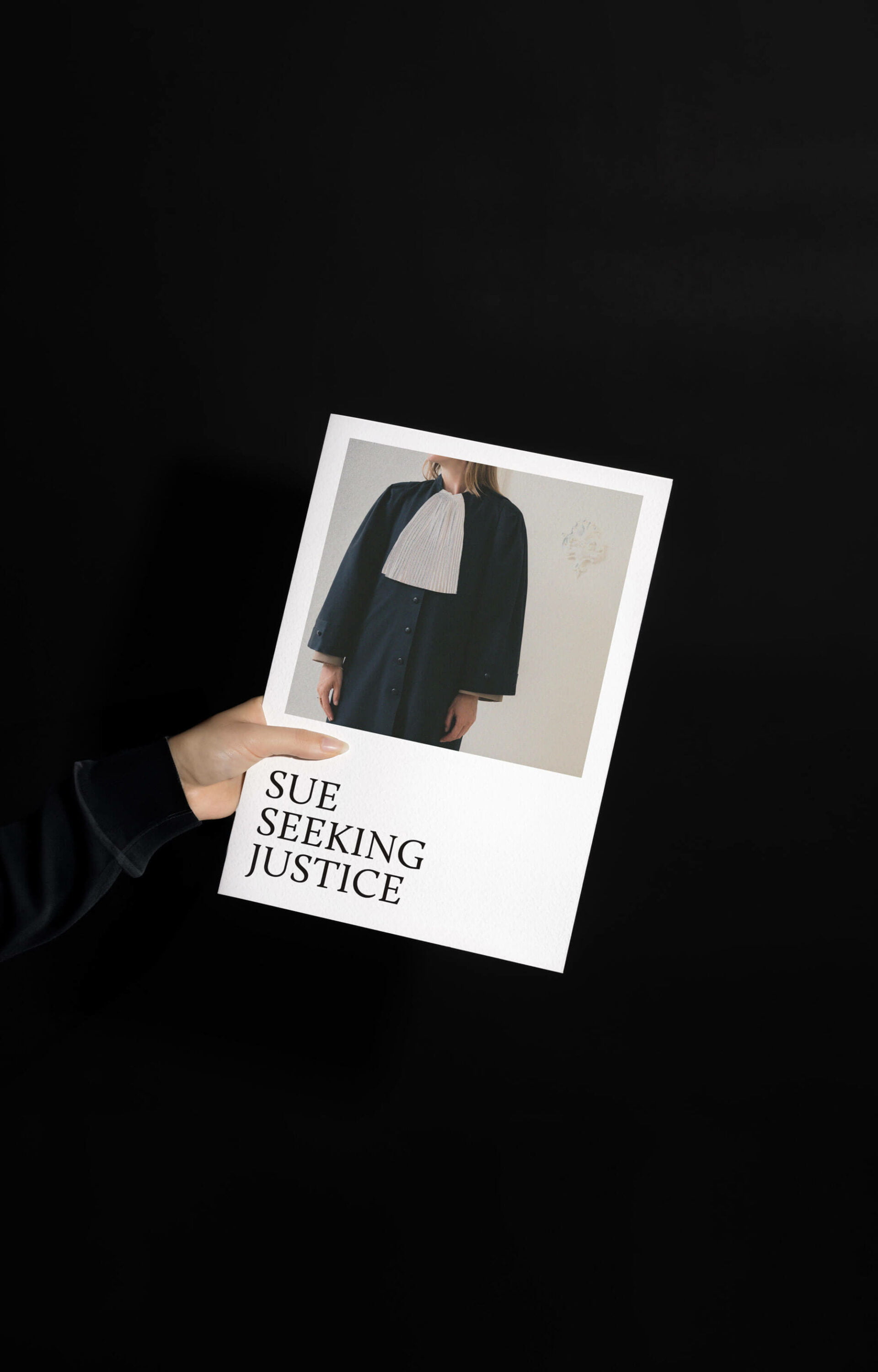
SUE is a law firm established by women that specializes in criminal law. They aim to stand out from the sea of dull grays by offering a more sophisticated vibe.
Year
2022
SLEEK GRID
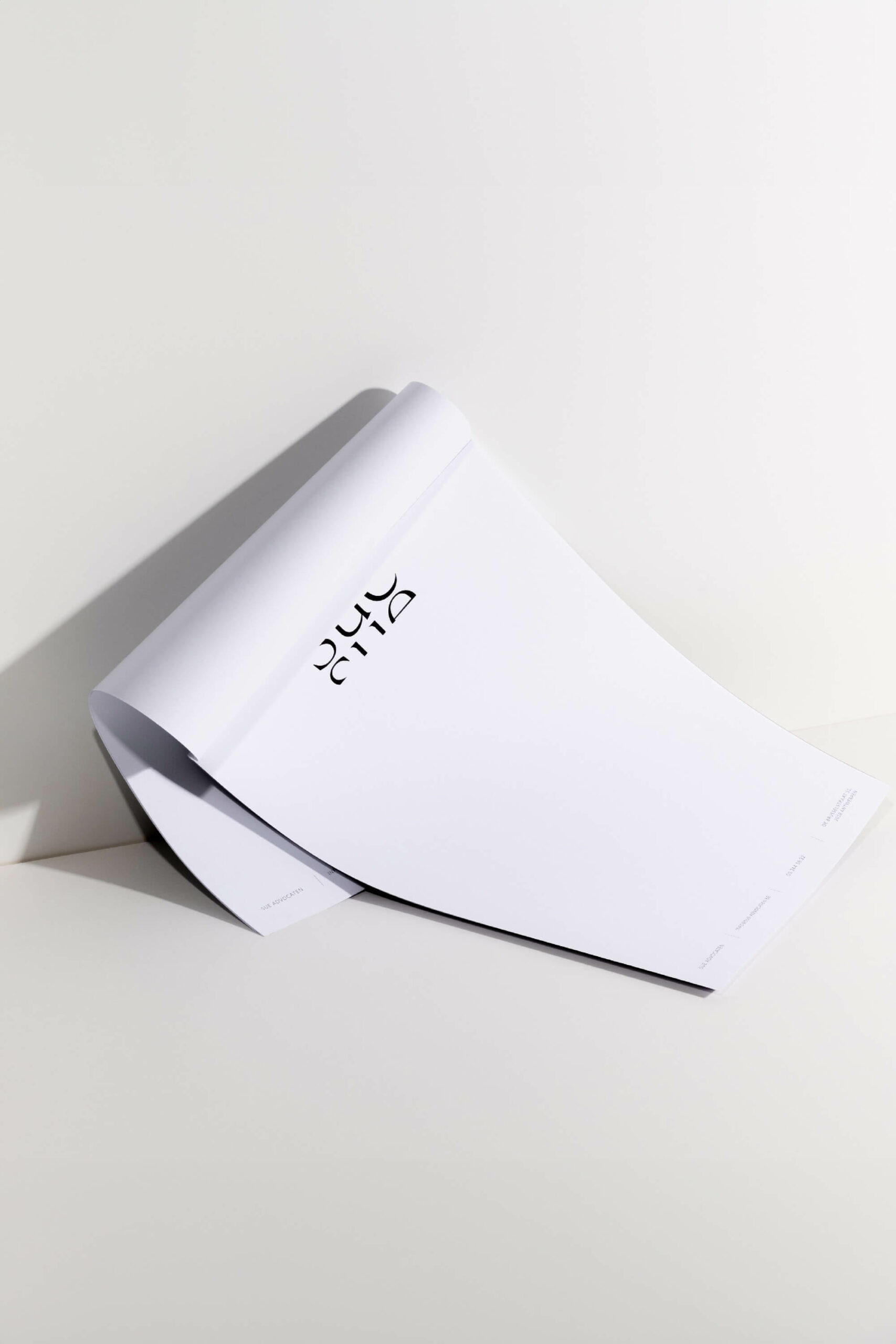
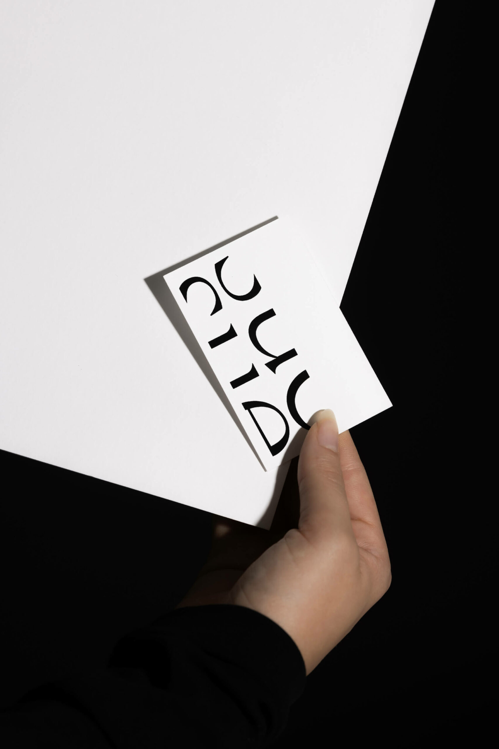
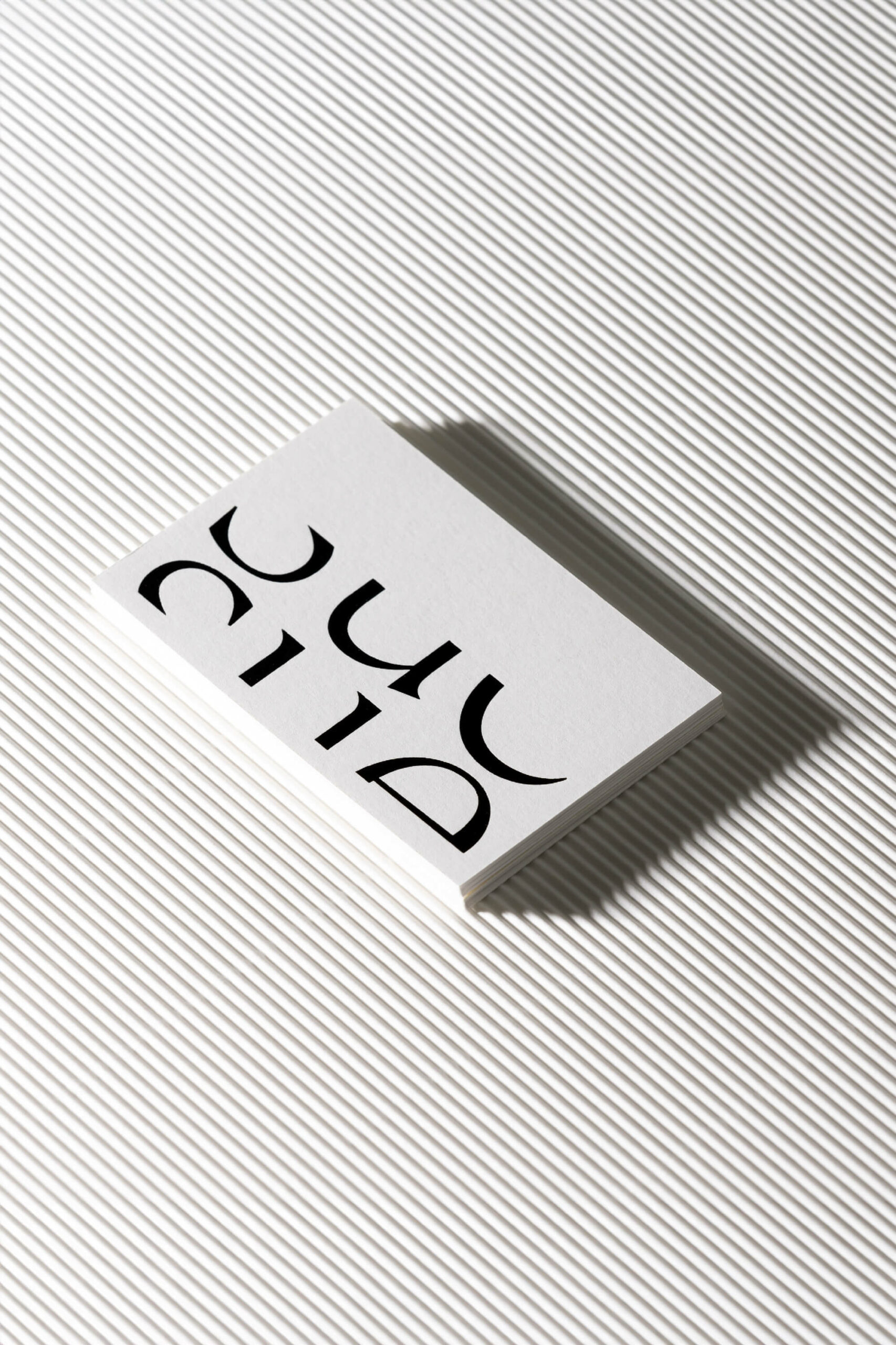
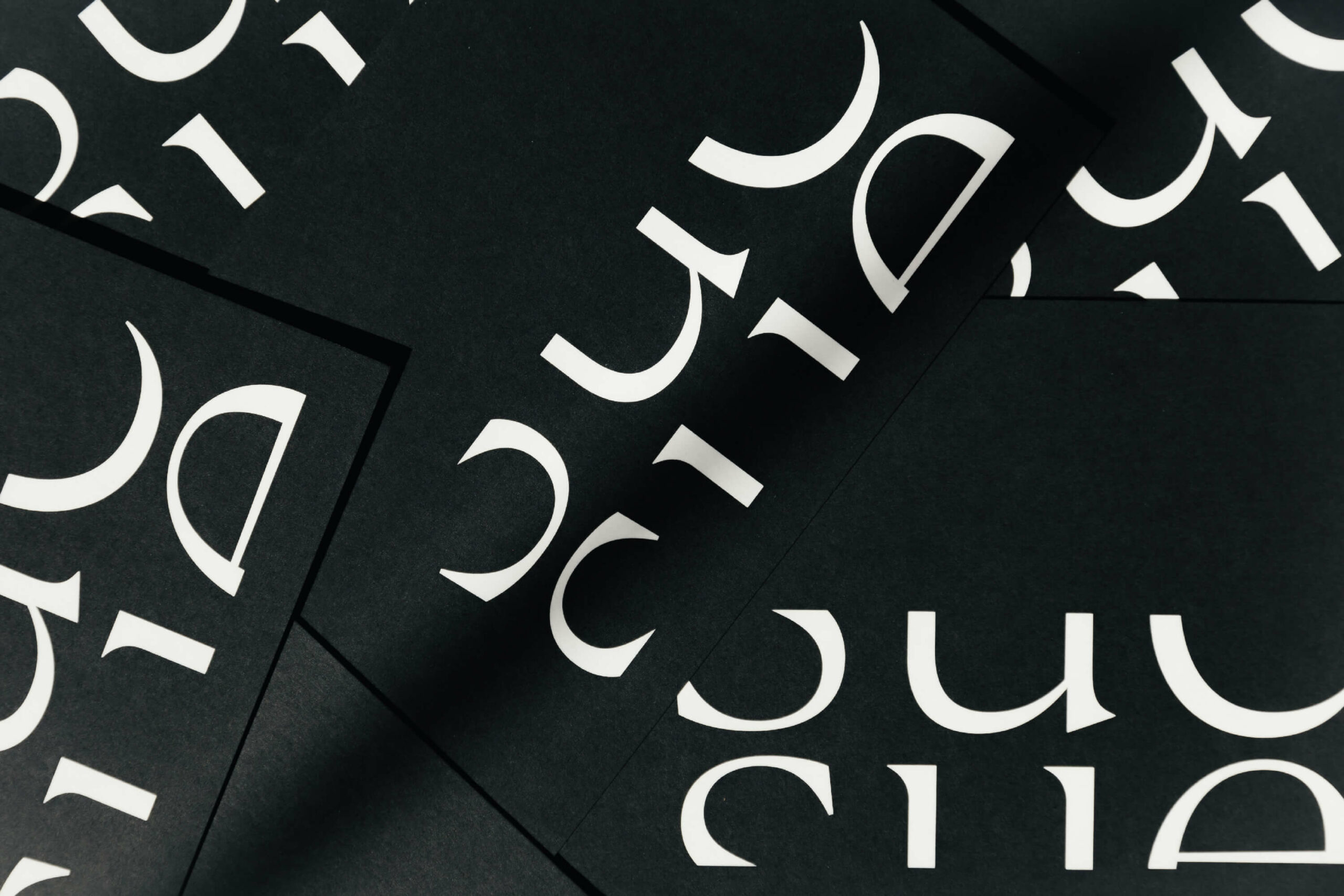
For their brand identity we took inspiration from a typical courthouse. With the house’s bold vertical lines as our muse, we delivered a sleek grid-like design that now serves as the foundation of the logo and brand identity as a whole.
LEGAL DUALITY
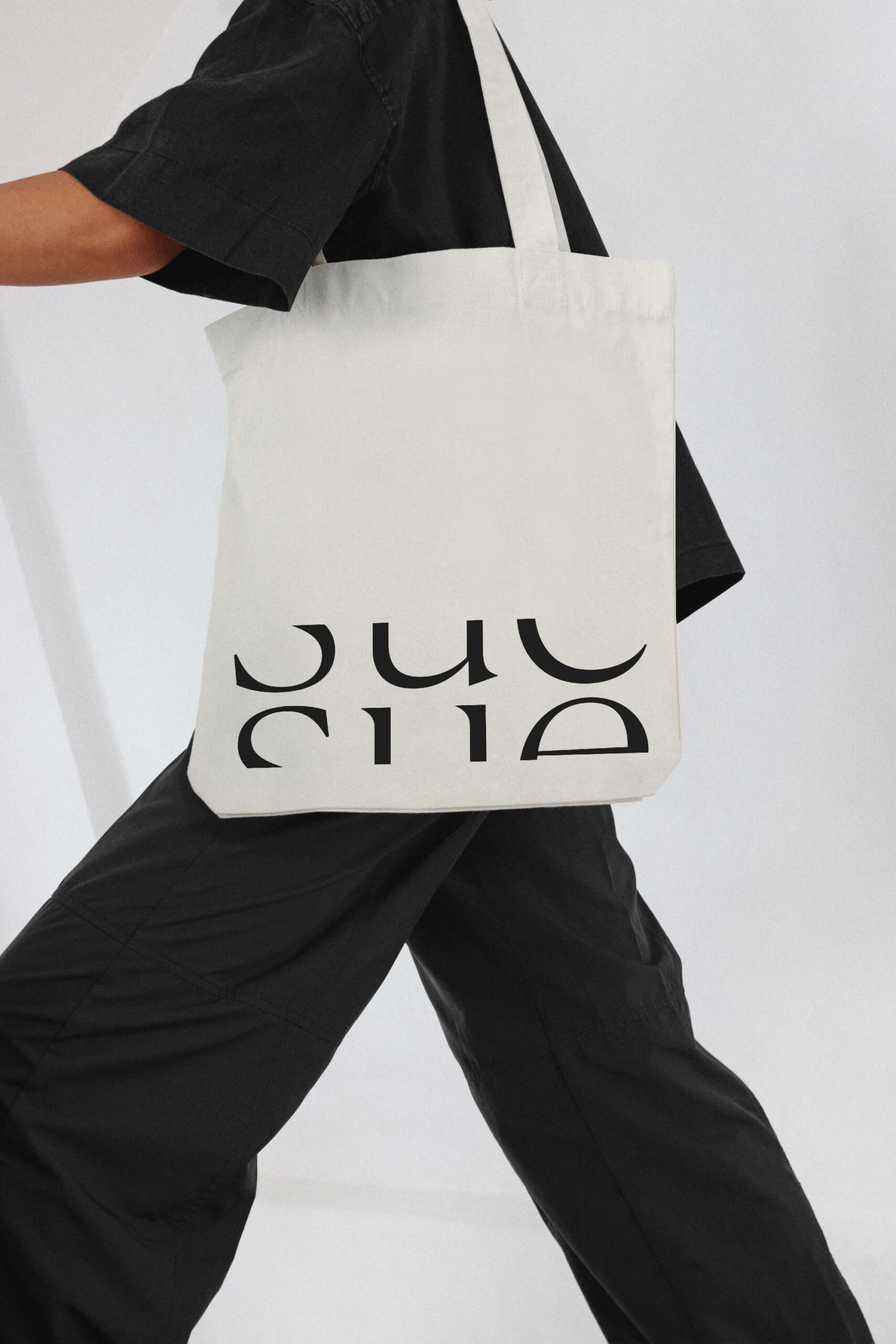
The logo itself was split up in two parts to refer to the two opposing parties in a legal case.
STYLISH INNOVATION
The overall feeling we wanted this project to exude is all about style and elegance. The clean, modern look reflects their fresh approach to law. By breaking away from the norm, SUE stands out in the world of law.
Credits
Photography — Katoo Peeters
