Paveau
- Brand Strategy
- Brand Identity
- Touch Points
- Packaging
- Website
Year
2021
Isabelle set out to create an earth-loving brand that’s no mere wallflower. We put our heads together to design a brand that would be unforgettable with a magical world of its own.
Year
2021
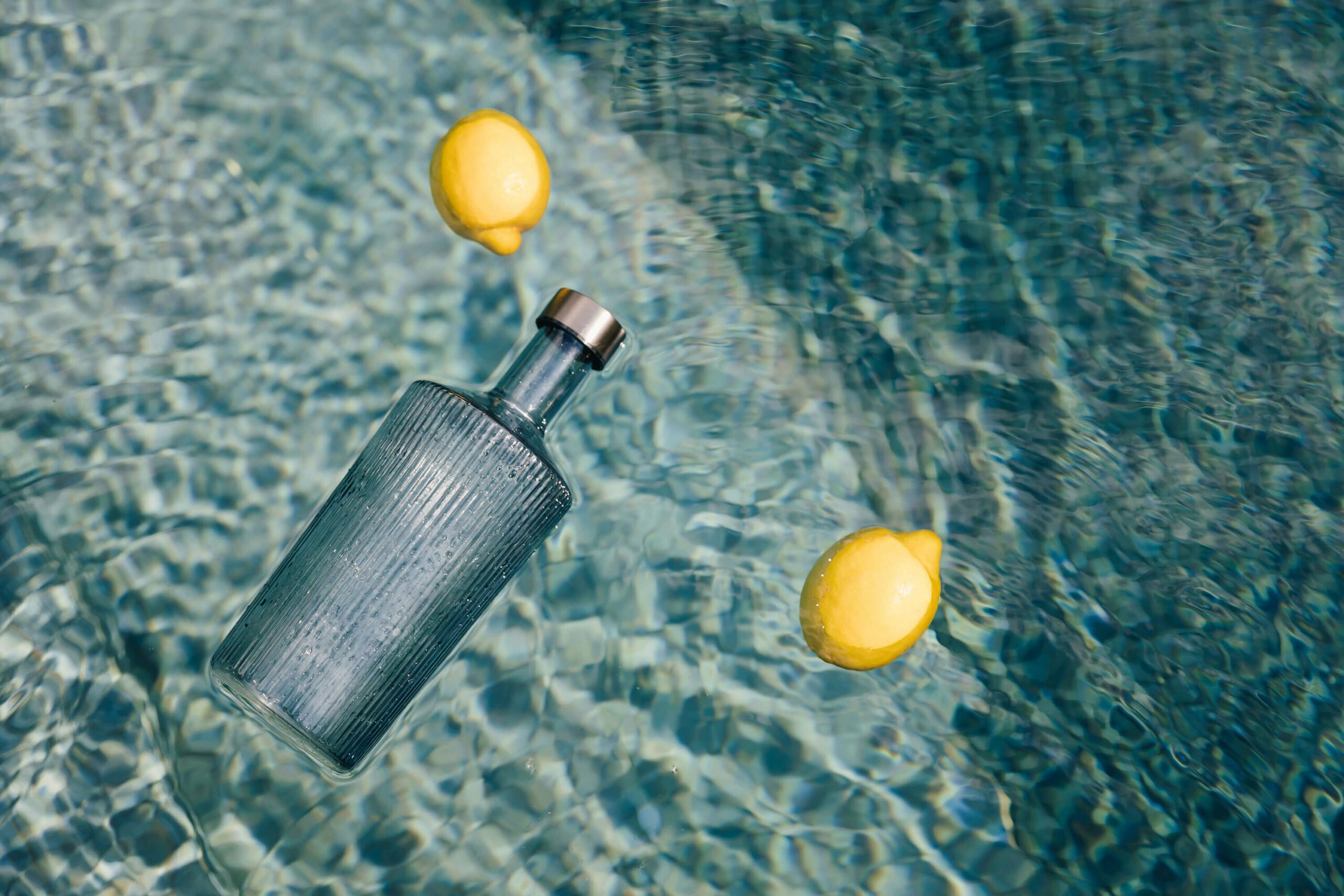
ReflectiNG on Water
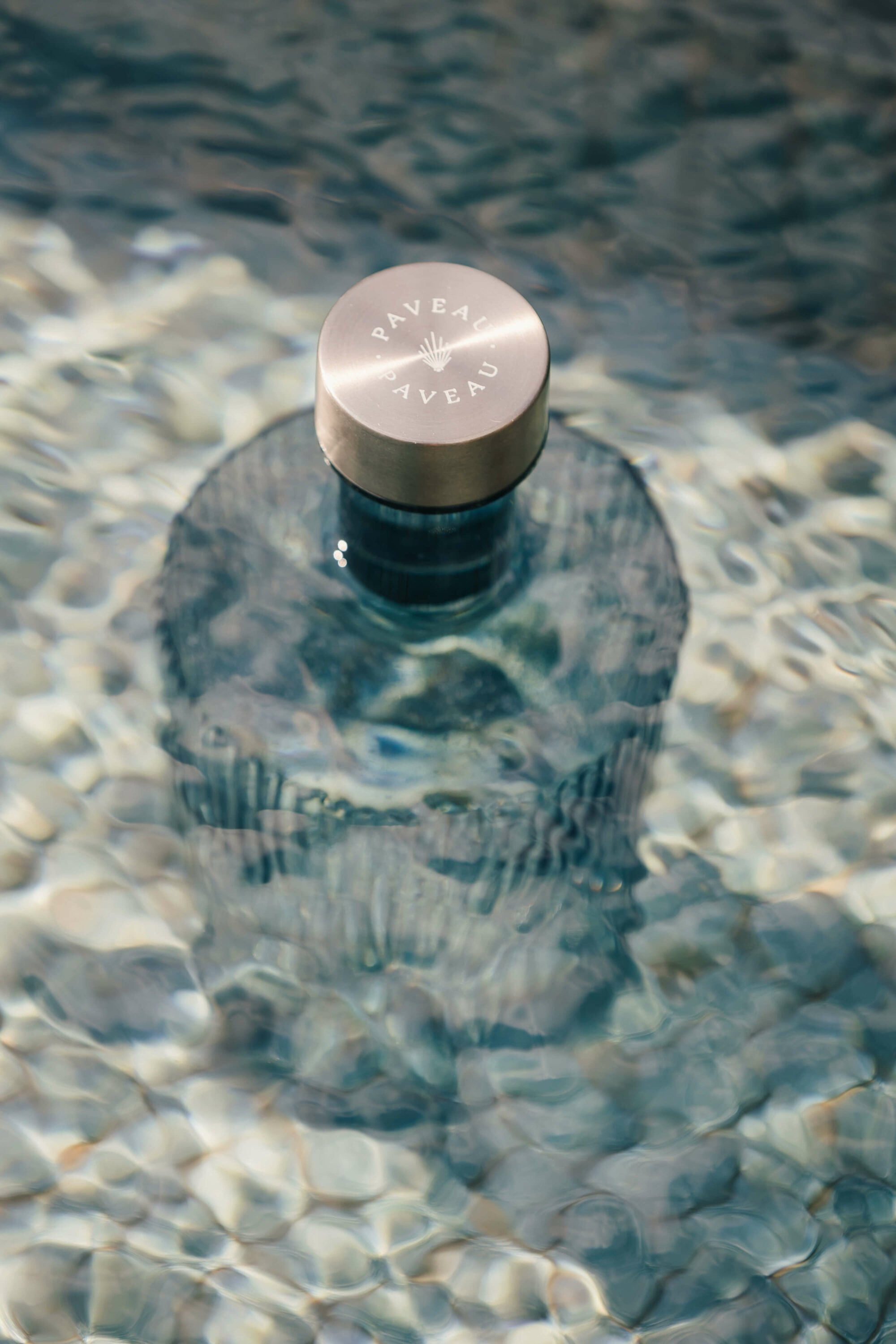
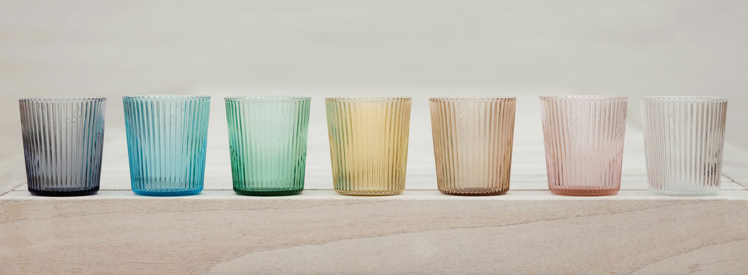
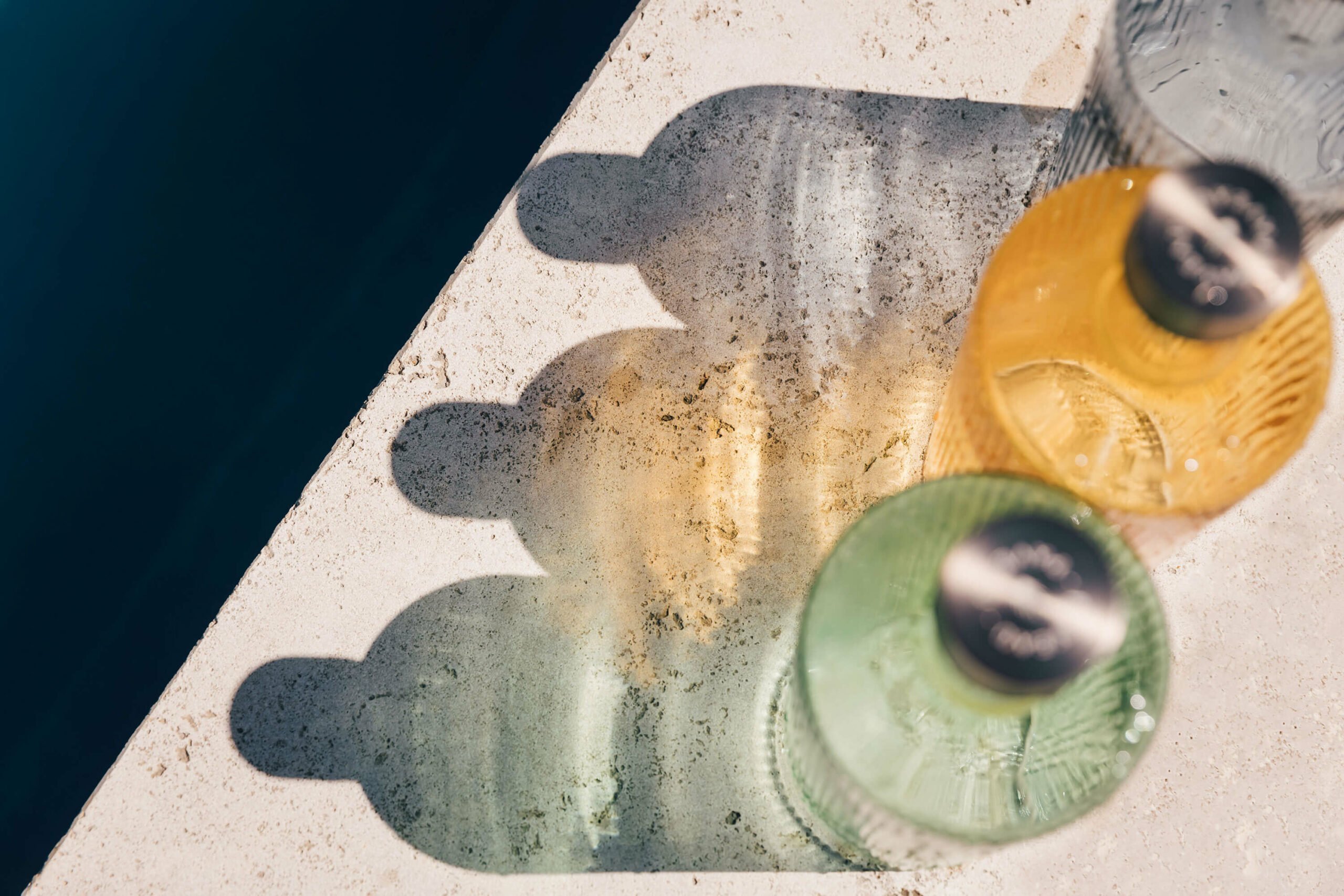
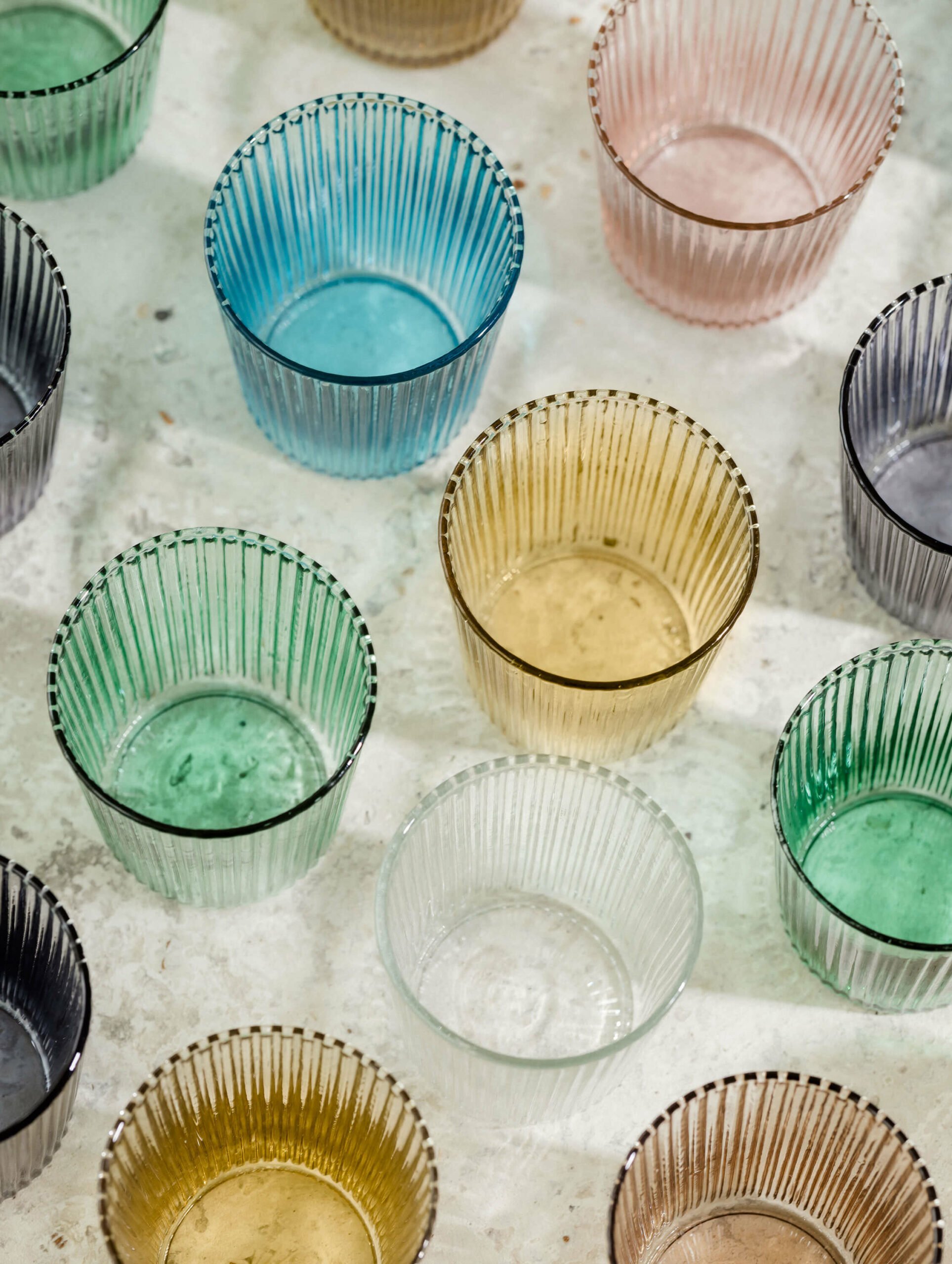
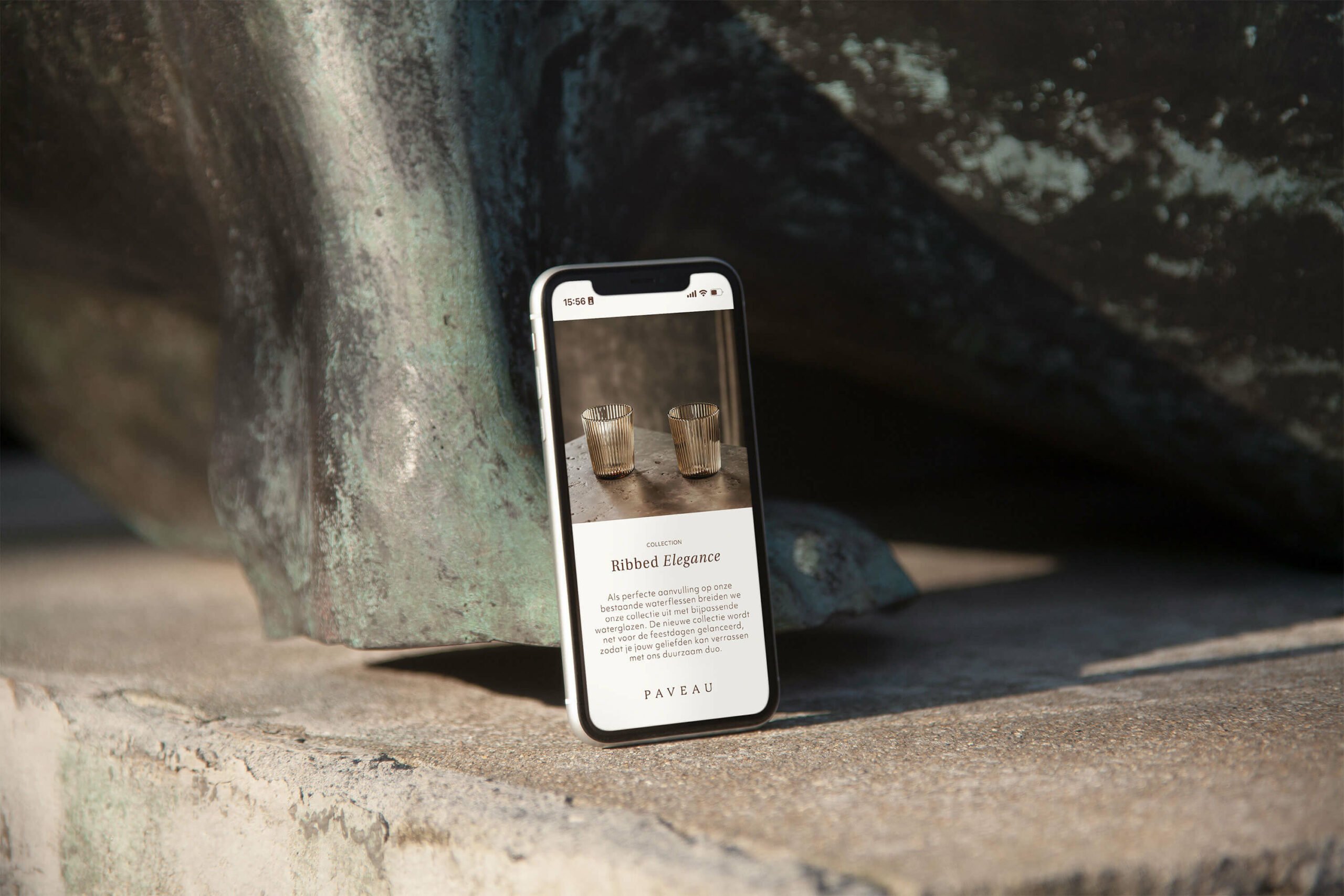
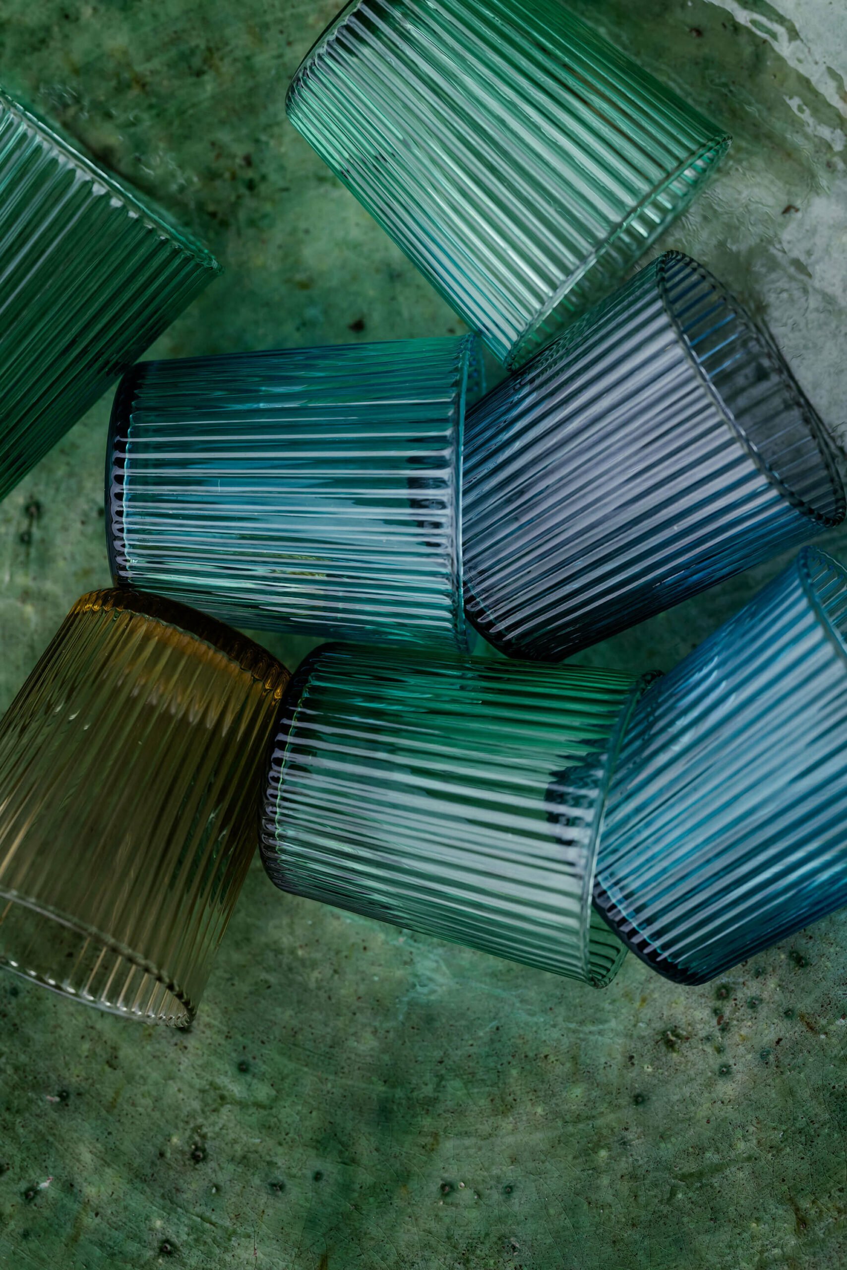
Introducing Paveau, a glassware brand that emerges as a trailblazer, reshaping the very essence of dining by artfully uniting sustainability, function and aesthetics. The story behind the birth of Paveau makes us reflect on our use of water. Isabelle’s mission is not only to bring a beautiful product to the market but also to make the world a better place. Thanks to her unique glassware creations, she singlehandedly takes on the plastic waste mountain and inspires other people to do the same.
ARTISTIC DETAILS
Our mission was to harmoniously fuse this beautiful concept with an elegant branding, subtly incorporating a peacock motif. Through hand-drawn illustrations, we were able to create a dreamlike world of Paveau, accentuating the beauty of nature and giving a profound meaning to her last name, “De Pauw.”
TRUE ELEGANCE
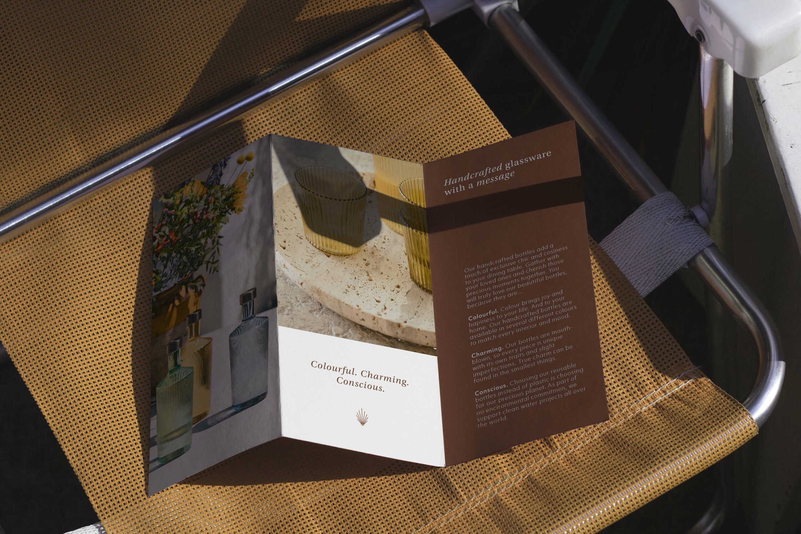
We opted for a timeless serif font for the logo and added a distinctive brandmark that supports the name in a modern way.
Warm colors, handcrafted elements, and luxurious branded materials were used to underscore the contemporary yet authentic nature of Isabelle’s creations.
SIP OF INNOVATION
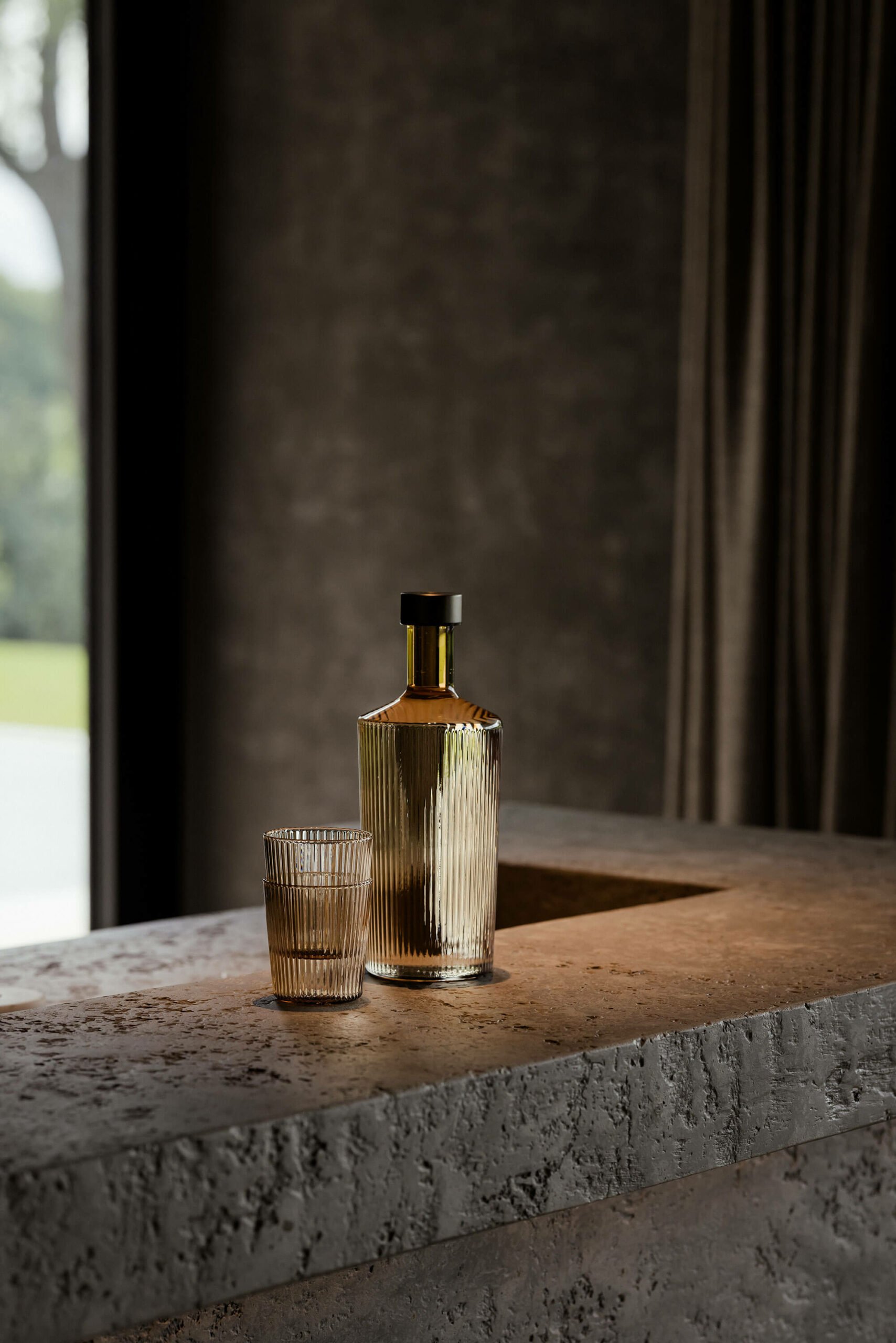
With each sip of her products, a tale of innovation unfolds, capturing the heart of Paveau’s sustainable journey.
CREDITS
Photography — Katoo Peeters
Illustrations — Ward Nijs
